Timeline
New #Evernote Home for mobile. Did I like it? Well, I have some suggestions.
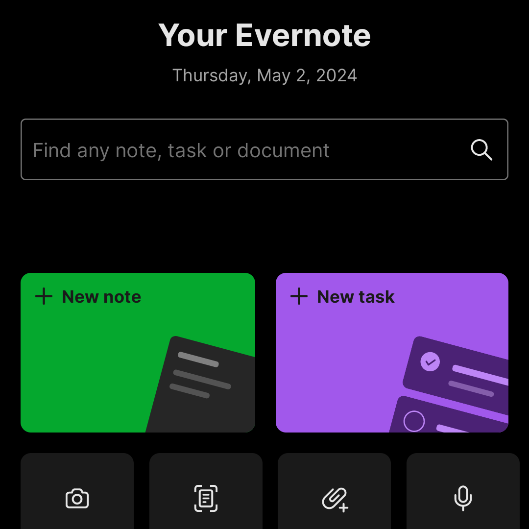
The Evernote mobile apps for Android and iOS have changed a lot over time. But one thing all the versions have in common is the struggle to strike a balance between using the notes we already have and capturing fresh info.
The creation buttons were always there from the very beginning, but eventually, they would be combined with different ways to get to existing notes. Sometimes, they would be more prominent at the bottom or top of the screen, as in the newly released version. Other times, a drop-down or Rolodex-style would take up more screen real estate to make old notes easier to find.
Around version 4 or 5, a star icon was added to the dock for quick access to the Shortcuts, which back then were called Favorites. Variations of the star would exist for numerous subsequent versions, occasionally being eliminated only to be reintroduced. The one I liked the most was a little notch at the bottom of the screen.

With the introduction of Evernote 7 for iOS, something similar to the current widgets was introduced. Users would be able to select which Rolodex-style cards they’d like to be visible, and sure enough, Favorites was one of the options.
Favorites or Shortcuts were the best way to get to specific notes before Evernote Home existed. But now there’s no quick access to either. Both are two taps away from the new Home screen. So, here’s what I’d like to see improved on this new mobile client.
First, I think we can agree that there’s enough room on that screen for a small start. Regardless of where it is put, we need quick access to a selected group of information in the form of notes, notebooks, etc. Also known as Shortcuts.
I know for a fact that many users love the Scratch Pad. One of my clients even uses it as a way to create all his notes. But I believe there are already enough “creation options” (buttons) on that screen to give advanced users a way to replace the Scratch Pad with another widget. In my case, for example, a Filtered Notes or Pinned Note widget would be of much more value.
Finally, the mobile widgets page settings should be completely independent of the desktop and web clients. As shown in the video below, I still see value on the widgets page, and I came up with a workaround to make it more pleasant to use. However, with quick access to Tasks and Calendar on the dock, there’s no need for these widgets on the old Home anymore. The problem is, if they are removed from there, they will also be removed from the desktop and web clients, where I do need them.
Also regarding settings, I am curious as to why the removal of the Scratch Pad widget from the old widgets page will also remove it from the new Home page.
What about you? Did you like the new Home for mobile? I would love to know your thoughts.
I didn’t know #Fallout was a game, but the more I watched it, the more I realized that the story was part of a bigger universe. I thought it was a series of books, but when I looked for it on YouTube, I fell into a rabbit hole, where I have been for the last few days. And I love it.
Now that I have access to the new #Evernote Home on my Android, there are many details I’m not happy with. A video about it is coming up tomorrow or Saturday.
I’ve been playing with #Scrintal for a few weeks, and when trying to learn more about the company, I came across the article below. I believe that its true value is actually in how the “two separate worlds” are available to the user.
The canvas is always there. The text-based component (the card) and the connections are all on the same space, where one can either view or work on them. I like this idea.
🤔 This app might end up in my Toolbox.
Scrintal brings two separate worlds together, the visual and text-based.
I am not sure if people are fully aware of the impact of Flipboard’s initiative to federate its content. The #Fediverse was completely unknown to many of these publications. Thanks to #Flipboard, we have access to all of them.
Flipboard Federates 11,000 Magazines by 400 Creators and Enthusiasts
Today Flipboard is taking two big steps toward opening its platform to the fediverse, making 400 creators and 11,000 of their curated Magazines visible to people in the fediverse and integrating fediverse notifications into the Flipboard app.
I am happy with the recent modifications made to #Evernote’s shared menu. It is now much clearer to the user what happens when creating a shared link. However, the publicly shared page still has a long way to go.