Tasks
AI as a powerful Tool, not a Commander.
It’s tempting to outsource more and more tasks to powerful AI tools. But how far should we go? Have we already reached a point where we’re blindly handing over too much control? And what harm is this already doing to our growth and critical thinking?
In a recent post, I discussed keeping AI siloed, and here’s an example of what I meant. When I’m with a client, I take notes while we’re talking. This helps me better process everything and puts my brain into an intentional mode. Which, in turn, helps me come up with important questions to ask in real time and also triggers ideas for solutions to their workflow.
Even so, sometimes real-time note-taking isn’t possible. For instance, the other day, when I was helping an independent professional, I was demonstrating how to use the Timeline System to build his workflow by sharing my Supernote screen. In other words, I didn’t have enough hands to type.
However, right after the meeting, I opened Voicenotes, pressed record, and started speaking as if I were typing in real time. If I can’t take notes during a meeting, I make sure to do it immediately afterward to avoid forgetting any essential details. After all, that’s the whole point of taking notes.
I usually write everything out, even if it’s after the fact. But, in this particular case, I had another appointment, and, as I said, I would rather not forget anything. (By the way, any similar application would have worked; I chose Voicenotes because it has a web app.)
After finishing the recording, I went to the web, copied the transcription, and pasted it into the client’s note in Obsidian. There, I fixed the mistakes and added additional details, which ultimately triggered new ideas, also noted down to be shared with the client in the next session.
Yes, I can hear you! Here’s why I haven’t used AI to do everything.
Imagine asking AI to create all the topics for a specific meeting. Then, it emails all participants who, during the meeting, used AI to record and summarize it. Each attendee then asks AI to generate suggestions. Finally, someone consolidates all the suggestions in another AI and asks it to create a plan of action.
You’ve probably seen jokes about this online, but is it that far from reality? If you are afraid of AI taking your job, at least stop helping it by handing everything over on a silver platter.
I know, we’ve passed the point where not using AI is possible. It’s challenging to avoid something that’s excellent for many tasks. However, I strongly believe it is a terrible idea to put it in control. If I had used AI to record, transcribe, and summarize everything, I would never have had the insights, which, in the end, would have made taking the meeting notes pointless.
Inside my Obsidian Homepage-a portal to what matters most.
Do you have an Obsidian homepage? What’s on there? 🤔 Mine gives me instant access to tasks, trips, projects, and family info. It works as an efficient dashboard to what matters most.
First things first. My homepage is basically a note, automatically updated with dynamic information from other parts of Obsidian. In other words, it’s a dashboard created using the Homepage plugin, as demonstrated in the video below.
Since it is the first thing I see when I open Obsidian, I expect the information there to be what I’ll be looking for most of the time. And what could be more relevant than my next tasks?
Using the Tasks plugin and some basic configuration that you can learn in the video below, I created four dynamic lists: Overdue, Today, Tomorrow, and Upcoming. There’s also a fifth one that is mostly for groceries, but I also use it for anything I need to buy. That’s why it’s called Purshases.
Next is a world map widget with pins on every place I’ve been. It’s a backup of what I have on Google Maps and is built and automaticity updated using the Map plugin. There’s also a short list with links to the itinerary notes of my next trips. I could have this list dynamically built like the tasks, but I don’t travel that much and manually creating it is easier and, as you soon see, more useful.
The dashboard information is ordered by how often I need or use each module. That explains my tasks at the top, but why the trips section is right below it? Well, there are at least two parts to a trip: planing and the trip itself. In my case, there’s also a third part. I love to keep a journal during the trip, and when I return, I adjust the details here and there.
Planing and organizing a trip is more than a list of tasks. So, having the link to the itinerary note means that I can constantly go there to monitor what I have already done and what I still need to do. Then, during the trip, I can easily open the itinerary, and inside that note, find invaluable information, like a link to the hotel on Google Maps.
Since I see the Homepage every time I open Obsidian, there’s almost zero friction. It’s just a matter of scrolling a little bit to get to the links right below my tasks and click or tap.
When I come back, it’s time for some fine-tuning, and that’s when not having the next trips list automated is helpful. If links to past trips have not yet been removed, it means that I still have some work to do. By the way, this is a strategy I use all the time. Keeping things in an undesirable place is a constant reminder.
And it also works for physical objects too. For example, I recently kept a giant bicycle lock on top of my desk to remind me that I needed to make a copy of its key.
Back to the Homepage.
Next is a Canvas widget of my Knowledge Base. It used to be the only one, but below it, I now have another one with all the information related to my Apple IIe project. That project was dormant for more than a year, and it wouldn’t make sense to keep it on the Homepage. Now that I’m working on it again, having a direct link to all that information is very welcome. This demonstrates how dynamic the Homepage is.
And speaking about the Canvas, it has become my go-to feature for visually organizing all the information I have in my Static Containers. My Family Documents container is probably the next contender to be displayed like that. But for now, they are embedded notes on my Homepage.
It’s a long list that sits as the last segment because it is definitely something I frequently use, but it’s the least needed when compared to the other items.
Having a Homepage like this is a game-changer, but it has to meet your needs and reality. If you could see the ones I help my clients build, you would be impressed by how different they are.
Another important detail is that your notes have to be organized using a system that works for you. Of course, I use the Timeline System, but regardless of which one you choose, there must be some sort of predictability to have a good dashboard. Without that, your dashboard will only be adding more friction to your life.
New Evernote Home for mobile. Did I like it? Well, I have some suggestions
The Evernote mobile apps for Android and iOS have changed a lot over time. But one thing all the versions have in common is the struggle to strike a balance between using the notes we already have and capturing fresh info.
The creation buttons were always there from the very beginning, but eventually, they would be combined with different ways to get to existing notes. Sometimes, they would be more prominent at the bottom or top of the screen, as in the newly released version. Other times, a drop-down or Rolodex-style would take up more screen real estate to make old notes easier to find.
Around version 4 or 5, a star icon was added to the dock for quick access to the Shortcuts, which back then were called Favorites. Variations of the star would exist for numerous subsequent versions, occasionally being eliminated only to be reintroduced. The one I liked the most was a little notch at the bottom of the screen.
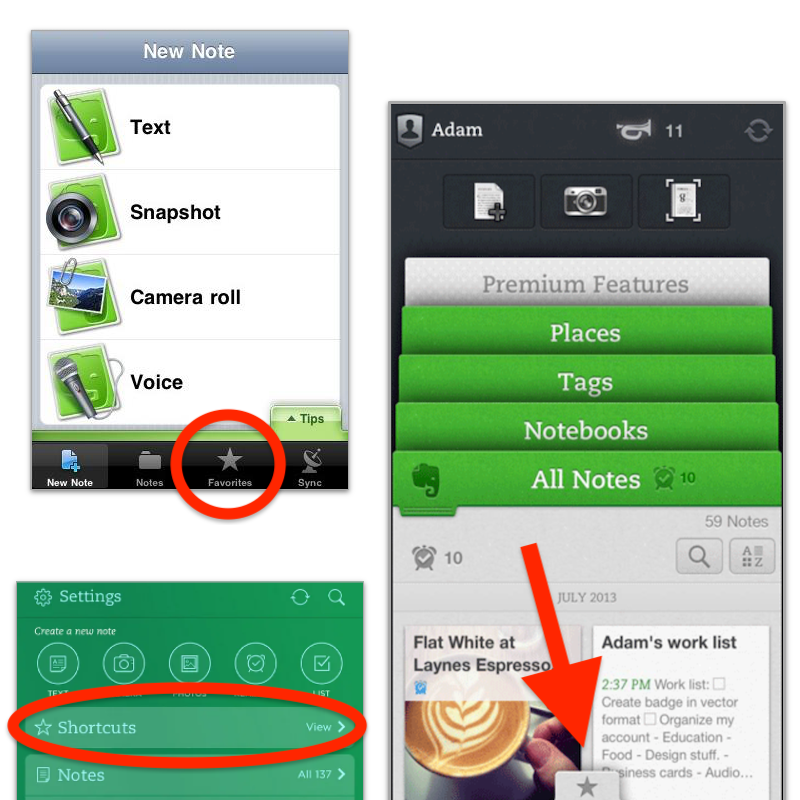
With the introduction of Evernote 7 for iOS, something similar to the current widgets was introduced. Users would be able to select which Rolodex-style cards they’d like to be visible, and sure enough, Favorites was one of the options.
Favorites or Shortcuts were the best way to get to specific notes before Evernote Home existed. But now there’s no quick access to either. Both are two taps away from the new Home screen. So, here’s what I’d like to see improved on this new mobile client.
First, I think we can agree that there’s enough room on that screen for a small star. Regardless of where it is put, we need quick access to a selected group of information in the form of notes, notebooks, etc. Also known as Shortcuts.
I know for a fact that many users love the Scratch Pad. One of my clients even uses it as a way to create all his notes. But I believe there are already enough “creation options” (buttons) on that screen to give advanced users a way to replace the Scratch Pad with another widget. In my case, for example, a Filtered Notes or Pinned Note widget would be of much more value.
Finally, the mobile widgets page settings should be completely independent of the desktop and web clients. As shown in the video below, I still see value on the widgets page, and I came up with a workaround to make it more pleasant to use. However, with quick access to Tasks and Calendar on the dock, there’s no need for these widgets on the old Home anymore. The problem is, if they are removed from there, they will also be removed from the desktop and web clients, where I do need them.
Also regarding settings, I am curious as to why the removal of the Scratch Pad widget from the old widgets page will also remove it from the new Home page.
What about you? Did you like the new Home for mobile? I would love to know your thoughts.
I had to go back to Evernote Tasks.
I was pretty happy with my system running on Google Tasks, but there are so many new things happening to Evernote Tasks that I had to go back.
Not too long ago, I wrote about moving my tasks from app to app and how good it is to rely on a system instead of an app. In other words, it means that I can basically make it work anywhere.
Yesterday I mentioned that Evernote had made the full-page Tasks available to many of us, including me, and that [[vladcampos.com/Timeline/Blog/2020s/2024/2024-04-21 • I have more thoughts on the latest Evernote update|I would use it for a while before expressing my opinion]]. I also hinted to the possibility of tasks coming to the calendar. Well, as illustrated by the tweet below, that one was quick.
There you have it. I’m back to Evernote Tasks and will be sharing my insights with you along the way.
I have more thoughts on the latest Evernote update.
A couple of days ago, I shared my initial thoughts on the new features in version 10.85.4, but there’s more to show you.
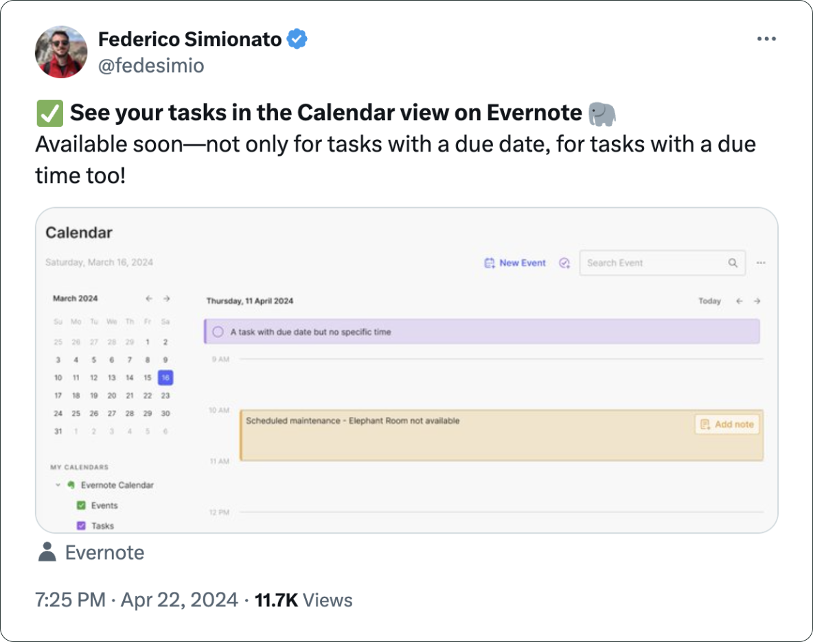
Let’s start with the first topic I talked about in video, the calendar. I was so focused on demonstrating the creation of events not connected to Outlook or Google that I missed a subtle new aspect of the Evernote Calendar.
In a recent conversation with Federico Simionato, I told him that I believed everything with dates on Evernote should be in the calendar. Have you watched that video? Do you recall him telling me he was already discussing that with the team? I think the new calendar may be setting the stage for that.
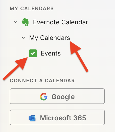
If you go to the Evernote Calendar and take a close look at the My Calendars section, you’ll see that there is a sub-menu under Evernote Calendar (image below). For now, the only item there is Events, but because My Calendars is in the plural, I think we’ll soon see other items there. Maybe Tasks? You never know.
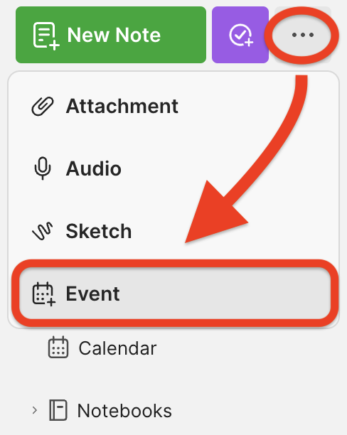
Another addition related to the calendar is the Events item in the three-dots menu next to New Task (image below). It’s great to see that menu getting attention. Let’s hope they keep making it more useful. For example, one other option I would like them to add in the future is the creation of a new note from one of our templates.
Finally, there’s the new full-page Tasks. I haven’t covered this in the video because I’ll be using it for the next few days before sharing my thoughts. But there’s one new detail I’m pleased to see there.
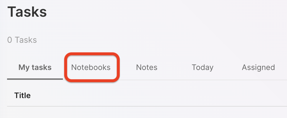
You are already aware of my stance regarding Tasks as an integral part of the fundamental building blocks of Evernote, namely notes and notebooks. So, I believe it is evident that I am delighted to see the addition of the Notebooks filter.
What about are you? Anything in particular you liked or that you are still missing? I’d love to hear your thoughts about this update.
Is Evernote becoming an everything app?
There are many changes coming to Evernote. I don’t see any problem with the app becoming more feature-rich, but I do have concerns about how it is done.
Two recent tweets from Federico Simionato, the product lead at Evernote, have led me to believe that the app is on track to become something different. There is currently a space for files being built, and many new features for Tasks are being discussed. Additionally, he told me in a recent conversation that he sees potential for Evernote to become a personal hub.
I don’t see any problem with the app becoming more feature-rich, but I do have concerns about how it is done. Evernote has a very intuitive structure. Notes, inside notebooks and tags to filter notes in a notebook or across many notebooks. That’s how simple it is to understand and use.
Thus far, each new feature that has been incorporated is layered upon this framework. Here’s an example: tasks and calendar entries are always connected to notes. And thankfully, it doesn’t look like the proposed Files feature is trying to compete with Dropbox, Google Drive, etc. It seems to be just another way to interact with the files we already have in our notes.
Out of Place
But based on the recent image shared on Twitter, it seems like the ‘new Tasks’ will not be aligned with Evernote’s framework anymore. It feels to me that it doesn’t belong there, as if an existing task management app has been implanted in Evernote. If this is the case, it may create some problems.
Some of the new ideas, such as ‘Projects,’ may introduce a new layer of classification and categorization of information, which may break the simple structure that makes the app so intuitive.
The Spaces feature on Evernote Teams is a great example of what I’m trying to convey. Just like a Stack, a Space is a group of notebooks. So when should one use one or another? To further complicate the understanding of how things work there, a note can be created outside a notebook in Evernote Teams. If you are an Evernote user, please tell me if this doesn’t feel like a crime.
To be honest, Stacks and Spaces exist for different purposes and are intended for different uses. But they look the same. So much so that it takes me some time to help my clients understand and assimilate the differences between a Stack and a Space.
There’s no other way to say it: Evernote Teams is not intuitive at all. If you have never used it, I suggest you watch the video below to see how confusing things can get.
Another Tasks App
Evernote was never a task management app. Tasks were elegantly incorporated, respecting the note-notebook system, and that’s what makes Evernote Tasks unique.
To be clear, I’m not questioning the need for or use of “Projects” or any other possible new feature like “Priority”. However, adding them has the potential to create distraction, since Evernote will have to compete with well-established task apps. Think about it: how many new features or variations of a feature are enough? How many colors of Flags do you need? How many types of Priorities? What about “Subprojects” or other ideas people have in the future?
Users will never be fully satisfied because there are too many ways to do things. They’ll start to compare Evernote Tasks to dedicated apps like Things, Todoist, etc. In other words, this will constantly create pressure on the development team to catch up.
Evernote is already lacking basic options and settings for features like Templates, Calendar, and even the editor. The situation is the same when we look at other apps that try to do everything. It’s like the old saying: try to do everything, and you won’t be good at anything.
I believe that using the simple, yet powerful framework of the app would allow people to create whatever innovative tasks system they come up with without having to wait for Bending Spoons to release the desired features.
Notebooks names could be used as a filter for grouping tasks inside a notebook, instead of introducing the new “Projects” layer. And if tags could be added to tasks, it would mean another filter option allowing each person to create their own priorities, flags, and anything else they want. This would make Evernote Tasks a space for users to create their own systems instead of complaining about Bending Spoons not working on new features.
Unfortunately, I believe the short-term easy option will prevail. They’ll just give the users another Tasks app like so many out there and hope for the best. Which seems to me like opening a can of worms. I can even imagine it leading to a dedicated task app. After all, there’s no way to compete on equal terms if your tasks are inside a notes app. It takes far too many steps to create a task.
Can you see how this can lead to an uncontrollable situation?
Loosing Focus
The current simplicity of Evernote results in limitations that serve as boundaries, and as a result, numerous non-tech-savvy individuals can efficiently organize their lives. People frequently tell me Evernote’s simple framework helps them with focus. This is not a small group of people, but they are silent on social media. So, I am trying to be as loud as possible for them.
However, I’m just one voice, and we may be already witnessing the birth of an entirely new experience with many new features and layers upon layers of configurations and categorizations. An Evernote that unfortunately has the potential to make many people’s lives much harder.
Google Tasks is just too convenient not to use
I had already moved my Evernote tasks to Obsidian with the help of the Tasks plugin, but I found out that Google Tasks was a better fit for my needs.
Even though I don’t like tasks, if you check out my videos about Evernote Tasks, you’ll see that I had a system in place for birthdays, bills, and other paperwork for my company. For everything else, I always use Kanban boards.
Similar to many other journeys I shared with you in the past, this one is also about experimenting and finding the best option for my specific needs. As I always say, it’s more important to [[vladcampos.com/Timeline/Blog/2020s/2024/2024-01-10 • There’s no such thing as the perfect App or a magical template|create a good system that works for you than to try to find a magical app]].
Did you know?
Although the Android and iOS apps were available from the very beginning, it used to be that the task drawer (1) was the only way to interact with your to-dos in a browser. That changed a while ago. You can also use Tasks as standalone application by clicking the icon at the top of the screen (2) or visiting tasks.google.com.
All the features are identical, but the dedicated page is more visual. You can reorder lists or move tasks to different positions in a list or to different lists. It behaves more like a Kanban board, but that’s not the reason I switched to Google Tasks.
Another important piece of information to keep in mind is that it doesn’t matter how many lists you create or delete; the first one provided by Google will always be the default list. You can rename or reorder it, but there’s no way to delete the default list. More on that latter.
Why have I switched?
There are many reasons. Let’s start with the fact that I have Google Assistant devices all over my home and office, and that makes it super easy for me to create tasks hands-free. There is a caveat, though. All tasks created this way will be saved in the default list. And because of this detail, I had to make a small modification to my system. We’ll get there.
Another convenient feature is seeing my tasks on the Hub Max. It recognizes my face when I look at it and shows my upcoming calendar entries and tasks. And that’s not all. I can even use the touchscreen to see more tasks and mark them as completed.
Then there is my Android phone, where I can also interact with the assistant using voice commands, even when I’m jogging. And, of course, I can use the widget to see what tasks are coming up.
These features are too convenient to ignore.
My system
I only have two lists. The first one is called Activities and it’s all about recurring dates. To understand it, I invite you to watch the video below, even if you are not an Evernote user. That’s the exact system that I have transferred to Obsidian and am currently using on Google Tasks. Including the emojis 😉.
Regarding the other list, it is the default list, even though it is ordered as the second one in my system. Everything I need to buy, from groceries to items for woodworking and other similar projects, goes on that list. It must be the default list because, more often than not, I ask Google Assistant to add items there.
I don’t know why, but at the time of writing this article, there’s no way to make another list the default one. I have learned this the hard way, but you don’t need to. Plan ahead and figure out what kind of tasks you’ll be asking the Assistant to add more often. That should help you with your default list.
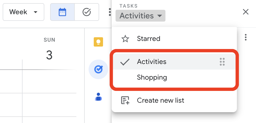
Activities is the list I want to always keep an eye on, and that’s why it’s the first one. Every time I open the calendar, I see it. As for the other one, I only need it when I’m shopping and can easily open Google Tasks on my phone to check the items.
But what if I told you that I never open the Tasks app on my phone? Each list has its own widget, which allows me to view the tasks, mark them as completed, and even create new ones. Again, Google Tasks is too convenient to ignore.
One thing I’m always trying to do is remove potential complications from my systems. In the past, I tried splitting shopping items into a grocery list and a projects list, but that only added more friction to the system, as I had a third list to deal with. Since I rarely have a lot of items to buy, my human brain is capable enough to easily tell what is what on the Shopping list.
Naturally, the number of items that have been completed on this that will increase exponentially, but that’s okay because they go to a collapsed space when marked as completed. However, if you really want a spotless list, the ‘Delete all completed tasks’ option will delete only the completed items on that list. So I can easily clean up my Shopping list without messing with my Activities list.
That’s it. As I said before, I manage everything else using Kanban boards because they give me a much better view of the status of each project. But that’s a story for another day.
I switched to Google Tasks
I’ve recently switched to Google Tasks, and there are a few clues as to why in this post. But detailed information is coming soon. I’m currently working on a script for a video explaining the hacks I used to build my system and why it might be a better choice, depending on what Apps and devices you use.
And talking about tasks, there are many videos on my channel about Evernote Tasks and the tutorial below explaining how to set up and use the Obsidian Tasks plugin.