Timeline
🤔 In summary, the new #iPads are even more powerful than my #MacBook Air M1, but the #iPadOS is still the same, making them lag behind.
Customizing #Evernote is a must-have option because everyone uses it differently.
Every so often, I get the impression that Bending Spoons is following some of the same problematic routes that have already been attempted before them.
I love how fast the new mobile experience is, and I’m sure people who create notes mostly on their phones are happier than ever. But what I’m feeling is discomfort. It’s now 5 days since I started using the new Evernote home for mobile, and I’m yet to use the main screen as intended.
Stacey Harmon said it best: “I have to think about it a lot more than I used to”.
(…) I’m really struggling to embrace the new Home. It is not clicking for me. (…) I’m missing the customized create button. The options there don’t reflect my preferred capture ways. (source)
I also am just struggling to navigate the app and get to what I want. I’m not finding it intuitive… I have to think about it a lot more than I used to. (source)
If we go all the way back to 2014, when Evernote 7 adopted a modern interface to replace the previews skeuomorphic design mimicking a Rolodex, some complaints were about the lack of customization. Which the company ended up addressing.
When Evernote 8 for iOS came out, customization was gone again. And, as inevitable as gravity is, I remember people asking for many settings. One of the more prominent among my community was a way to turn off the recently used notebooks from the top of the notebooks list. Which, by the way, I didn’t felt the need to remove. In fact, I liked it. And that’s precisely my point.
Customizing Evernote is a must-have option because everyone uses it differently. So much so that Evernote 10 brought back many ways to personalize the app. Unfortunately, that’s now gone again.
But credit has to be given when it’s due. Bending Spoons was able to put together a user interface that has the best elements from many older iterations.
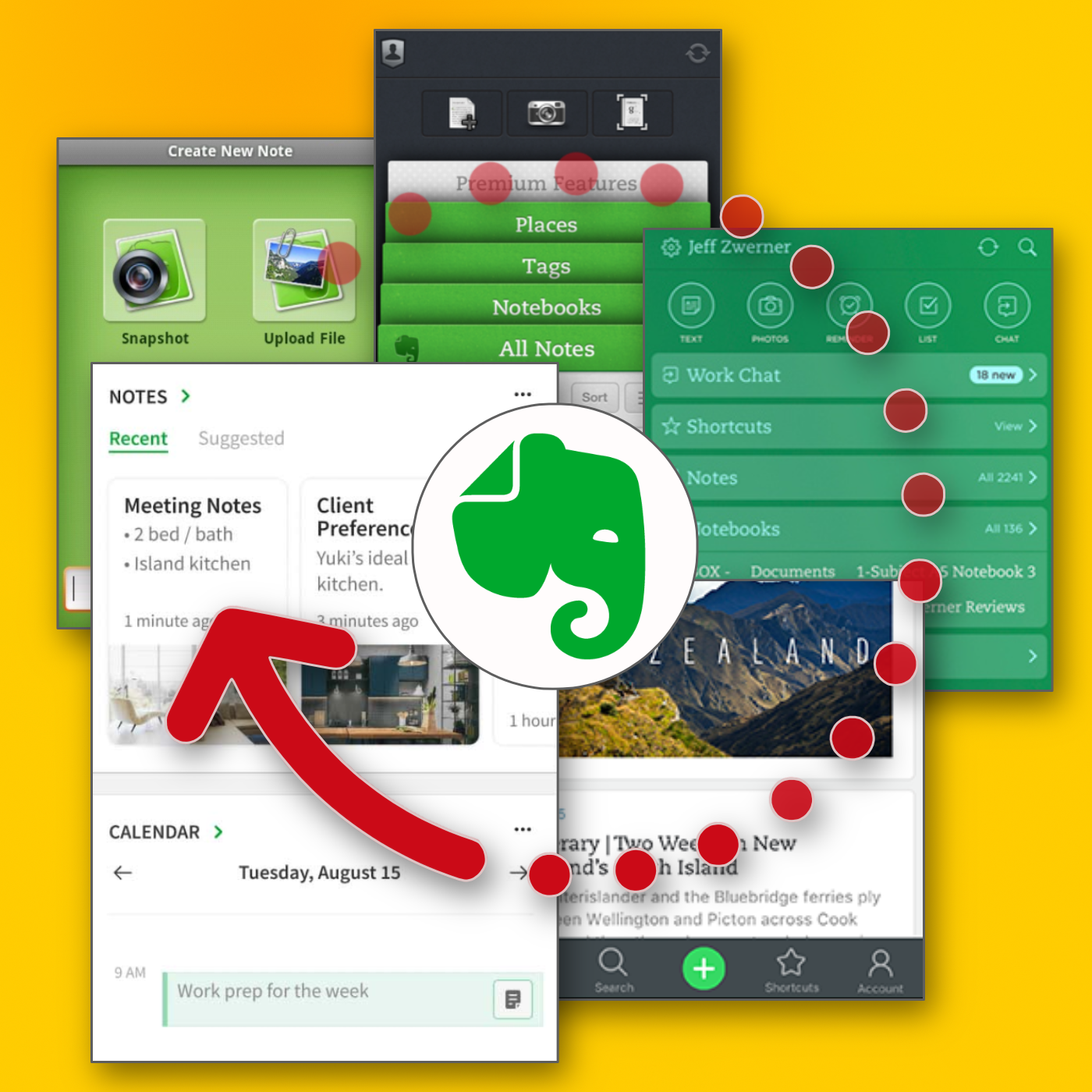
The creation buttons that were used on the first versions of the app are back. Then there’s the dock from Evernote 8, which makes it a breeze to switch from one view to another. And there is even a widget borrowed from the original version 10. To top it all off, this might be the fastest Evernote app ever released.
There’s just one missing piece: customization. And that’s something they could’ve learned from history. Evernote users need options simply because each one of us has a different vision of what makes the perfect Evernote experience.
And talking about history, in the second part of the video below, you can see a glimpse of how I try to keep Evernote’s history intact. Ironically, I do that using Obsidian.
Hey #Evernote, please allow us to personalize the new Home.
Today’s video is an experiment. I always liked the chronology vibe of a vlog, and I wanted to add it to my channel. But instead of my daily routines, what I would like to do would be to share a constant stream of content related to my interactions with products and services I use and love.
It’s of course, easier said than done, but I think I’m getting there. Today’s video is as close to what I have in mind as I could ever get. The first important element is that it starts as a follow-up to Saturday’s video. Then there are the related topics. The beginning of the video has everything to do with one of Obsidian’s vaults, which in turn is linked to what I find interesting in Scrintal.
💚 I just finished moving all my tasks back to #Evernote. The new notebook tab is even better than I had expected. I’m keeping notebooks with recurring tasks collapsed, which makes all the other tasks highly visible. I am looking forward to seeing that tab in the mobile app in the future.
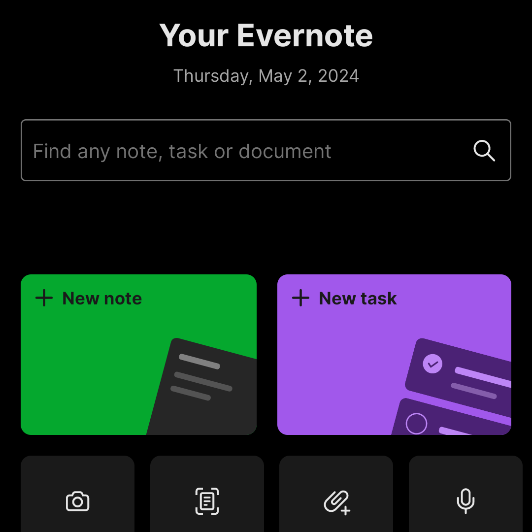
📝 New #Evernote Home for mobile. Did I like it? Well, I have some suggestions.
The Evernote mobile apps for Android and iOS have changed a lot over time. But one thing all the versions have in common is the struggle to strike a balance between using the notes we already have and capturing fresh info.
The creation buttons were always there from the very beginning, but eventually, they would be combined with different ways to get to existing notes. Sometimes, they would be more prominent at the bottom or top of the screen, as in the newly released version. Other times, a drop-down or Rolodex-style would take up more screen real estate to make old notes easier to find.
Around version 4 or 5, a star icon was added to the dock for quick access to the Shortcuts, which back then were called Favorites. Variations of the star would exist for numerous subsequent versions, occasionally being eliminated only to be reintroduced. The one I liked the most was a little notch at the bottom of the screen.

With the introduction of Evernote 7 for iOS, something similar to the current widgets was introduced. Users would be able to select which Rolodex-style cards they’d like to be visible, and sure enough, Favorites was one of the options.
Favorites or Shortcuts were the best way to get to specific notes before Evernote Home existed. But now there’s no quick access to either. Both are two taps away from the new Home screen. So, here’s what I’d like to see improved on this new mobile client.
First, I think we can agree that there’s enough room on that screen for a small star. Regardless of where it is put, we need quick access to a selected group of information in the form of notes, notebooks, etc. Also known as Shortcuts.
I know for a fact that many users love the Scratch Pad. One of my clients even uses it as a way to create all his notes. But I believe there are already enough “creation options” (buttons) on that screen to give advanced users a way to replace the Scratch Pad with another widget. In my case, for example, a Filtered Notes or Pinned Note widget would be of much more value.
Finally, the mobile widgets page settings should be completely independent of the desktop and web clients. As shown in the video below, I still see value on the widgets page, and I came up with a workaround to make it more pleasant to use. However, with quick access to Tasks and Calendar on the dock, there’s no need for these widgets on the old Home anymore. The problem is, if they are removed from there, they will also be removed from the desktop and web clients, where I do need them.
Also regarding settings, I am curious as to why the removal of the Scratch Pad widget from the old widgets page will also remove it from the new Home page.
What about you? Did you like the new Home for mobile? I would love to know your thoughts.
Some very good points in here. We are 100% confident that the new home is far better for the majority of customers (you'd be surprised to discover how many people don't ever customize their widgets). That said, I do understand that advanced users need more customization. We'll…
— Federico Simionato (@fedesimio) May 3, 2024
I didn’t know #Fallout was a game, but the more I watched it, the more I realized that the story was part of a bigger universe. I thought it was a series of books, but when I looked for it on YouTube, I fell into a rabbit hole, where I have been for the last few days. And I love it.